Showing posts with label Asides. Show all posts

Tuesday, 29 January 2013

Finishing Up

Vectis is finished. The book is completed. There are a last few things to be done, that I will link to here as I finish them off over the next few hours.

Contents Page:


A contents page is available here.

PDF Download for the completed work:


http://dl.dropbox.com/u/94448765/Vectiswebfinal3.pdf


A Lulu purchase link, and a link to the blog for my next project, will be posted here sometime in the next couple of weeks.

Friday, 21 December 2012

Robinsonnage

"In 1894 Joris-Karl Huysman wrote Against Nature (the novel that inspired Oscar Wilde to write A Picture of Dorian Grey) at one point, the Parisian hero of Huysman's tale, fascinated by the novels of Charles Dickens, orders a taxi and visits an English pub in Paris, before embarking on his trip to London.

Except...he finds himself unable to complete the journey and returns home.

Whereupon he realises that the imaginary experience is more than a preferable substitute for the real thing."


A robinsonner is a traveller who does not travel. A cousin of the flâneur, the robinsonner takes their name from the character of Robinson Crusoe. Daniel Defoe wrote Robinson Crusoe without ever having visited a desert island himself, or indeed having ever left Europe. Defoe has a special place in the history of psychogeography, with Merlin Coverley claiming that his 1722 novel  A Journal of the Plague Year represents the beginning of the psychogeographic tradition. Patrick Keiller, of course, references this in his character of Robinson, who's (adopted) name is also a reference to his being 'marooned' in Britain. 

Tuesday, 11 December 2012

5 Styles of Book Design?

During the course of my MA I have been doing a lot of thinking on the subject of books and book design. One thing I have noticed, throughout this thinking is there seems to be a relatively small number of styles or end-goals of book design. All books strive (or fail), it seems to me, to achieve quality based on one or more of these competing metrics. I present five possible metrics, with the above diagram notes common ways they might intersect in the form of a Euler diagram. Of course, these are not prescriptive, nor are they the only such system one might come up with. By changing the definitions, and the borders between definitions, an infinite variety of categorisations are possible.

The Book Beautiful

This style of design is often said to have found its ultimate expression in the work of William Morris's Kelmscott Press (example). It emphasises the aesthetic qualities of the book as a thing of beauty, to be enjoyed as much (or more) as the text and images within. Often more masterpieces of the bookbinder's and printer's craft skills than the book designer's considered aesthetics, the book beautiful may be seen as an old-fashioned, fuddy-duddy sort of concept, evoking marbled endpapers, hand-sewn bindings, tooled leather covers, gilt-edged pages and meticulous printing, perhaps referencing early incunabula and other medieval books. This is not necessarily true, however; the concept of the book beautiful extends to even mass-market paperbacks, where particular attention has been paid to the aesthetics of the book as an object and, crucially, these aesthetics could be said to assume equal (or greater) importance compared to the contents of the book.

The Book Functional

This style of design is that championed by technical masters such as Jan Tschichold, and draws heavily on Beatrice Ward's Crystal Goblet metaphor. In this style of design, the book is treated chiefly as a container, an object for presenting a text, or images. Decoration is minimal or non-existent and the number of typefaces is kept to a minimum. Margins and the overall size are considered from the perspective of ergonomics as much as aesthetic beauty. Indeed, proponents of this style claim that the most functional book will be the most beautiful book. This is linked to enlightenment ideals, and will often lead them to sweeping, absolutist pronouncements, never examining the cultural parochialism of such a view. Not all examples of the Book Functional are of the same type: textbooks come under this heading.

The Book Frugal

This is a sort of book where the entire design is dictated by economic considerations. Paper stock, binding, cover designs; all are chosen to be as cheap and inviting as possible. This type of book may superficially appear to be similiar to the Book Functional, but ignores many of the ergonomic, aesthetic, durability and other concerns that may appear in this category. The Book Frugal covers a huge swathe of the modern book industry. The vast majority of mass-market paperbacks fall into this type; pulp fiction indeed.

The Book Grotesque

A special case, this rare form of book can be thought of as the absolute opposite of the Book Beautiful, and perhaps could be thought of as a subset of the Book Visual. The Book Grotesque does not necessarily aim at ugliness as it's explicit goal, but it achieves it, for whatever reason. Perhaps it is an artist's book, or the product of some small, incompetent press, or an example of art brut? There will always be some people, of course, who claim that the grotesque is beautiful, and others who claim that the beautiful is grotesque. This will always necessitate the need for the existence of this classification.

The Book Visual

 The book visual represents the bulk of artist's books, but also many other sorts of books; atlases, books of aerial photographs, and so on. The Book Visual considers the book in terms of aesthetics. Its design is not simply as a structure for presenting other information (as in the Book Functional) nor is it decorative (as in the Book Beautiful). The Book Visual is the masterwork of the designer. It's end goal is not necessarily beauty (or some concept analogous to beauty such as richness, cool etc.) but it might be beautiful to some people's eyes. It has a style that is not necessarily aimed at presenting information in the most efficient way, though it may achieve a high standard of presentation.

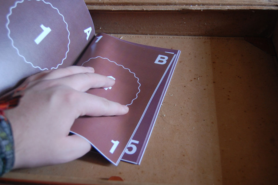
Vectis is a Book Visual.


Friday, 30 November 2012

This Land is Your Land, This Land is My Land

When making art that plays on geography, on ideas of space, place and landscape, it is perhaps impossible to avoid the subject of Land Art.

Land art appears only fleetingly in Vectis, in a couple of the images of the visual essay, 'On the Shoulders of Giants...' in the Spring section. Although not actually at odds with pscyhogeography, land art takes things a step further. It is a deliberate intervention in the landscape, an attempt to change it, to add to or subvert its meaning. For rural psychogeography it is the equivalent of architecture in urban psychogeography. This places land art beyond the scope of my personal project, which is one that attempts to understand the island as it currently is, rather than to change it.


Tuesday, 16 October 2012

Blog illustration

A little aside now on that picture from the Romanticism post below. I took the rather unusual step of making an illustration to fit a blog post. I was in a rut with other things creatively at the time, and that seemed to be what I needed to do; it won't happen too often (any further ballooning of the huge amount of work I still have to do for this project is to be definitely avoided). Actually, I made three different possible illustrations, all along a similiar theme. The one I chose was a bit of an experiment that I might take further at some point in the future. It is not, as it might first appear, either a doctored photograph or a hyperrealistic drawing, but a combination of digital painting and digital collage; it's actually made from about ten different photographs of trees and wooded areas, mixed together and overpainted. I came at the idea whilst trying to assemble a reference image to draw from, and I think it's quite effective. A more rigorous approach, carefully cutting out sections of trees and limbs and foliage and layering them up, might be something to try another time. Below the jump are the other two, unselected, Romanticism pictures; a treated photograph with some text and a straight up fantasy woodland nightscape digital painting, which was great fun to do but doesn't have that much relevance to the issue at hand, although it might be interesting in light of the next post.

Romanticism


 It's a dirty word to some people, 'Romanticism'. It conjures all sorts of bad images; airy, shallow, irrational, wooly thinking, schmalzy. It can even carry dangerous political connotations; a reek of nationalism hangs over it. Deep England, and all the problems that entails. Much of this, I feel, has to do with a lack of general understanding about what Romanticism actually entails. It doesn't have anything to do with Romans, and it doesn't have anything to do with love...

"Romanticism has very little to do with things popularly thought of as "romantic," although love may occasionally be the subject of Romantic art. Rather, it is an international artistic and philosophical movement that redefined the fundamental ways in which people in Western cultures thought about themselves and about their world." - source


Tuesday, 9 October 2012

Record of Tutorial: 8/10/2012

This blog is, as I have mentioned before, a piece of work that I plan to submit as part of my MA in Fine Art; if I am to make it a complete submission there are certain requirements that must be fulfilled. One of these is to discuss and reflect upon tutorials. I have been going back and forth as to whether to add these to the blog, and have finally made my decision. I have backdated this post to the time when I wrote it.

Although my course continued technically unbroken over summer, there has not been much face-to-face contact with my supervisor, Prof. Stephanie James. This tutorial was really not much more than a catch-up session. We talked mainly about this blog, and about how the general structure of the project was progressing. Overall, the feedback was positive. Steph suggested that I look in to broadening the online presence of the project, finding a way to display the raw photographs online through a picture sharing service such as Pinterest or Flickr. We also discussed the possibility of putting elements of the project in to action locally; we talked about the possibility of taking people on the walks as guided tours, and about the possibily of selling prints and books through local art galleries. Overall, the feedback was very positive. The second year will be more hands-off, especially with this blog in place. The tutorial left me feeling very confident as to the direction in which this unit is heading, though I still worry a little about timing.

Monday, 8 October 2012

Hidden in Plain Sight: Occultism

It is impossible to get too far in to the matter of modern psychogeography without dealing with what we might call the occult, or the esoteric. More or less directly, many psychogeographers (particularly the London school) have tapped in to a variety of concepts common to various traditions of western mysticism; hermeticism, alchemy and gnosticism, via modern occultism. Particularly important (as they are, framed differently, in much modern art practice) are ideas of symbolism and correspondence. Alchemists believe that an object can be manipulated through its reflection or image; hermeticists believe in the direct correspondence between the microcosm and the macrocosm ('as above, so below') and gnostics believe that the reality we perceive is simply a deceptive projection, a curtain pulled across our eyes. In occult psychogeographic writing, the landscape and the individual become reflections of each other; the landscape becomes the medium through which wider social forces shape the individual, and vice versa. It also becomes the point of interaction between the real past, the past-as-myth and various conceptions of the present. Place here is not simply the banal reality of physical geography, but an imaginative (and imagined) space. The very use of occult language (as opposed to what can often be equivalent artistic jargon) is employed deliberately, to create an air of mysticism. The landscape, whether urban or rural, is a place of secrets and a battleground for interpretations. The occult psychogeographers employ their mystical methods in order to reinforce their own interpretation, without necessarily seeking to make any claims towards truth.


Sunday, 23 September 2012

Processional I: First printing

The first copy of Processional I arrived yesterday morning.


Mostly, I am very satisfied with the quality, the colours and so on; unfortunately, the bleed has not worked properly, as can be seen in the following picture:


There are only at most a millimetre or so white margin, and only on some pages. The width of the margin changes as the book goes on, indicating that the problem might be to do with the printing process rather than my settings. I am rather at a loss, as I followed the instructions online exactly; however, I shall try setting the bleeds a little wider and send the book off again when I have some more money. The main purpose of Processional I, remember, is to sort out colour, bleed and paper quality for Vectis itself. I will also be looking at creating another book to test out the higher quality paper, which is only available in certain limited, non-ISO standard sizes.

Thursday, 20 September 2012

Idle Toil

Idle Toil is the name of my 'publishing house', the entity through which my books are published. You will have seen the Idle Toil logo if you looked at the PDF in the last post. Currently, it looks like the example to the right. The idea that the name could be split up in this way was part of the thinking behind it's choosing; it came when I was doodling the logo and the name simultaneously in my sketch book. It has some obvious reasoning behind it. There is the similiarity of the second syllables allowing (with a little poetic license) the remixed words to be pronounced as homophones. There is also the fact that each couplet of letters is a word (in some language). I also liked the fact that the logo works well as a design element on a page; it is a solid block, broadly symettrical, and has a strong vertical presence. However, there is no reason to just accept the logo (which is after all essentially a first design) as a fait accompli, and there's something a little unsatisfactory about the logo as it currently stands. So, I've tried a few redesigns. I am rather fancying the one in the bottom left.

Processional I

Not much to put on the blog over the past few days; I've been working, but more on visual matters. I've also been at work on a physical model of Vectis, despite my vow not to engage in any physical bookbinding. It's wonderfully addictive work, unfortunately, and, as always when you're thinking something out practically, there have been a few false starts. Expect something nice to look at in the not-too-distant future. Until then, here's a little 'side project' book, Processional I:


It's a very simple idea; it's simply a procession or sequence, bounded by the letters of the alphabet, cycling back round through a circle in opposite directions (I was thinking about the year-based structure of Vectis). Actually, the real purpose of this book is not as an artistic expression (shock, horror) but more as a way to test out the capabilities of lulu.com, the print-on-demand publishing service which I have chosen to employ, for the moment, to produce my books. Particularly, I have not yet ordered a book from then in colour, nor have I done a book with full edge bleeds. I actually sent the order through yesterday morning (I've simply had no time to post since then) and I'll update with some pictures of the finished product when it arrives.

Tuesday, 11 September 2012

The Society of the Spectacularly Crass

I was going to make my next post on the subject of the prison; in fact, I've begun writing that post. It's beginning to turn rather political (I think unavoidably) and maybe that's got me into a mood. I was just over the shops, and perused todays newspapers, the front covers of which are united in celebrating the orgy of self-congratulation that, I sincerely hope, marks the final, irrevocable end of the olympics.

I have touched already on my problems with the olympics in the version of the introduction I posted, but I'd like to tie that a little more in to a specific point about the Island, and also to illustrate the thinking behind some of what I have already written. The point is this: That the olympics are a fascist spectacle, and that one of the most fundamental differences between London and the Isle of Wight is that it is impossible for the olympics (or similar events) to occur in the latter.

Wednesday, 5 September 2012